Orca Card
An (unsolicited) responsive website design to optimize desktop & mobile

The Challenge
ORCA, or One Regional Card for All, is the greater Seattle area’s cashless public transportation payment card. ORCA’s website is currently unresponsive and uses outdated design standards. It does not support easy access to information or card management.
The Solution
By redesigning the existing website’s UX and UI, ORCA can better serve its diverse users' technological needs. Our goal was to create a singular, dynamic design that caters to the needs of all who use Seattle transit.
The Results
Our team improved the System Usability Scale score (SUS score) by 38 points, as well as shortened the time required to complete tasks on both desktop and mobile.
The Team
Christine | UX Research
Doe | UX Research
Me | UX Research & Visual Design
Context
Concept design
Group project
Tools
Figma
Miro
Monday.com
Duration
2 weeks
Learning to Speak ORCA
Since none of us were from Seattle, we had to familiarize ourselves with the ORCA card system.

ORCA's current homepage on desktop and mobile

ORCA's current user portal on desktop and mobile
Major Limitation for Design (and Users)
Orca Terminology & Online Limitation
E-purse | Holds a pre-paid value on your ORCA card and deducts the correct fare each time you tap.
Regional pass | Good for unlimited rides during one calendar month. Buy the amount that represents the fare you take most often.
Autoload | The set value will load onto your ORCA card when the existing value is not sufficient to pay your fare. If you set up an Autoload for a pass, it will load the first time you tap your card in the new month.
Add value | ORCA's terminology for adding money to a user's card in the form of E-purse credit or a pass.
Value added online takes 24-48 hours to be added to cards. Many users said they prefer to add value at kiosks at stations because it's instant.

In order to gain access to ORCA's internal system I bought an ORCA card and had it shipped to me.
Comparing the Clarity of Other Transit Systems
I conducted a competitive analysis to research how other highly-rated transit systems organize their websites.
The table below has 3 key elements I wanted to evaluate.
-
ORCA's user portal doesn't clearly show how to add value
-
ORCA does not have a responsive design
-
Users think that ORCA’s terminology is confusing

Competitive analysis of other high-ranking transit systems compared to ORCA.
*If we were to expand this project further, we would consider if changing the terms “Add Value” and “E-purse” would make a significant difference in usability as users suggested. We ultimately decided to focus our efforts on more impactful changes.
Using Card Design to Enhance UX
I conducted a comparative analysis to show how card design would optimize space and improve usability.
Since users wanted all of their most important pages to be easily accessible, I eliminated ORCA’s side navigation and made the most-used tasks into actionable cards. On mobile, using a one-card-wide layout and condensed drop downs were common across both comparative sites.

Comparative analysis of desktop and mobile layouts that utilize a card UI design.
Regular Riders Prefer Kiosks to the Website
Our team conducted 6 user interviews and used affinity mapping to identify general trends about user’s behaviors and opinions on ORCA’s current visual design.
"It's easier to just reload my card at the station than do it online."
Users felt it was easier to reload at a kiosk rather than online. However, those that used the website did so on desktop, never mobile.
Across all users, the most common actions were checking balance, adding value to their E-purse, adding a pass, managing their autoload, and checking their transaction history. They felt the flow of the site was clunky, confusing, and took too much effort In addition, a few users thought that ORCA’s terminology wasn't intuitive.
“The colors are the one nice thing about the website.”
All users commented on the outdated look of the site. They didn’t mind the colors or fonts but felt it could use some polish and that there was a lot of underutilized white space. Users liked the branding of the site, which ties in the actually design on the ORCA card.
Meet Our Riders
We developed 2 user personas - a regular ORCA user and a new Seattleite.

[Unsplash: Dan Botan]
Madison | Primary User
Madison is a long-term resident of Seattle and familiar with the ORCA system. Madison takes both a bus and a light rail to get to work, so she uses an ORCA card to cut costs. Madison buys a monthly regional pass for her commute and also adds money to her E-purse for pricier trips.
When Madison swipes her card, it tells her if she's running low on E-purse value. She wishes she could go on the ORCA site on her phone (like while she's standing on the platform) and add money, but the mobile version is too small. Therefore, she has to wait until she gets to her laptop, and even then it's frustrating to navigate.
_jp.jpg)
[Unsplash: Yingchou Han]
Rob | Secondary User
Rob just moved to Seattle for his Masters and wants to live off-campus. He's heard that the ORCA fare structure is more complicated than what he's used to. He wants to feel confident in his understanding before using Seattle transit so he doesn't get lost or look like a tourist.
Rob already has an ORCA card, but he needs to create an online account and add money to it. He also wants to learn more about how ORCA works.
Sketching a Solution
Our team came to consensus through sketching a series of low-fidelity wireframes.


We facilitated a design studio session where we individually sketched for 10 minutes and then presented and ideated afterwards. We combined the best features from each of our ideas into a collaborative design.
The Financial Tradeoff of Updated Branding vs. Navigation
In our UI we wanted to communicate familiarity and reliability. Our palette and typography were taken from the original site. We kept this branding because changing the visual elements was not the most impactful use of ORCA’s (likely limited) funding.
We also found in our research that even though users felt the original site looked outdated, the primary concern was navigation. Once navigation was made easier, the visual elements became less of an issue. This is why we decided to prioritize the structure, but upon request from ORCA, we would absolutely revisit the visual elements.

[kingcounty.gov]
#1C1A7A
#244A9F
#246161
#949BAA
Design & Refine
We created 2 prototype iterations of our design based on feedback from users.

Original
The non-responsive design forces users to zoom in to interact with the website.

Iteration 1
Content is optimized for screen size but font size is too small and the design lacks polish.

Iteration 2
Important tasks are all above the fold and the refined UI adds more dimensionality and clarity.
Homepage - Inviting & Educational
We revamped the homepage to be more inviting and user-friendly for every type of user. There is a section for new users like Rob who can read about how ORCA works, while regular users like Madison can still log in quickly.
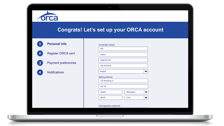
Onboarding - Less Confusion & Fewer Clicks
The cognitive load it took users to figure out how to get their account set up was sometimes high enough to discourage them from using the site altogether. On the new site, users input all their info from the start, instead of through multiple disjointed pages like in the original site.
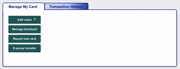
User Portal - Easy Access to Most-Used Features
We reduced the navigation options significantly and clearly displayed top-of-mind tasks on a single page. On mobile, the most important tasks are all above the fold. We used dropdowns to condense features.
User Feedback
We conducted 6 usability tests asking users to execute tasks and share their thoughts.
Finding 1 - Users Want a Robust Payment Confirmation
In the first iteration, there wasn't enough visual feedback for the payment confirmation. Users wanted to be confident that their submission was received, so we redesigned a more robust pop-up.

Iteration 1

Iteration 2
Finding 2 - Buttons Drive Intentional Action
We thought having the portal page automatically open to the "Add value" section would make it faster for users, since it's one of their most-used actions. It actually took users longer to read the whole section. Now, users only have to read "Add value" and intentionally click in to that feature. This change added a click but actually saved the user time. It also helped condense and simplify our UI.
Users click to reveal the Add Value process in Iteration 2 .
Finding 3 - Optimization, Sizing, & Clarity
Participants commented on the overall empty feeling and large font sizes of our first iteration. We cleaned up the color and size distribution and added a gray background for contrast. We also reoriented the right-facing arrows since users thought they led to a new page.

Iteration 1

Iteration 2
Measuring Success
We tested V1 with users and came away with promising metrics. We are confident that usability testing for V2 would show another positive trend.
15 sec
AVERAGE TIME SAVED
ON MOBILE TASK
When 5 users were given the same task of setting up Autoload on their card, the average task time decreased from 54 to 38 seconds.
26 sec
AVERAGE TIME SAVED
ON DESKTOP TASK
When 5 users were given the same task of adding value to their E-purse and monthly pass, the average task time decreased from 1:57 to 1:31 minutes.
+38
SUS SCORE POINTS
The System Usability Scale (SUS) provides a quick, reliable tool for measuring usability. Based on results from 3 users, the SUS score of the original and V1 sites jumped from 26.4 to 65 points.
Next Steps
In continuing this project, we would do a second round of usability tests and task analysis on our V2 prototype to further improve our design. From a few users who have given informal feedback, it is clear we need to evaluate our color contrast accessibility in parts of our design.
We would also like to test users who have never used ORCA before and build out the information features to see if we've made it easy enough to comprehend as a new user. In addition, a deeper exploration into ORCA's terminology may show us if it indeed affects the user experience.