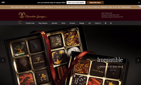
Chocolate Springs
A redesign project to boost usability and navigation for a luxury chocolate eCommerce website

The Challenge
Chocolate Springs is a popular cafe in Lenox, MA offering luxury chocolates with high-end ingredients and unique flavor options. It's a go-to spot for locals and a bucket-list destination for seasonal tourists.
Unfortunately, its eCommerce site is not well known, is difficult to navigate, and does not reflect the customer experience of the luxury café.
The Solution
By redesigning the existing website's navigation and visual identity, users will have a much smoother and more enjoyable shopping experience.
The Results
Improved System Usability Scale score (SUS) by 25 points, as well as improve site navigation and time to complete tasks.
My Role
UX Researcher
Visual Designer
Context
Concept design
Solo project
Tools
Sketch
InVision
Duration
2 weeks
Understanding the User
First, it was crucial to research the needs, goals, and motivations of the customer, target market, and business.
Identify Potential Buyers
I sent a screener survey to 21 participants ahead of my interviews to find current and potential users of Chocolate Springs. My main objective was to find interview people who were familiar with eCommerce shopping, had opinions about how a website's design affected their experience, and buy chocolate with some regularity.

Example questions from screener survey about chocolate preferences and online shopping habits.
Gain Insight from Interviews
I conducted user interviews with 2 regular customers and 2 non-users of Chocolate Springs.
Goals of user interviews:
-
Uncover motivations of chocolate-buying habits
-
Gather opinions on the visual design of Chocolate Springs' & competitor's websites
-
Collect qualitative & quantitative data about navigation by giving participants tasks
As part of the interview, I timed participants on how long it took to locate the Dark Chocolate Covered Pretzels on the current site. Later, when testing the usability of my redesigned site, I gave users the same task and compared the time averages.
Expose Patterns
Plotting similarities through affinity mapping helped uncover key patterns among users.
Current Customers
There is strong local brand loyalty and is a go-to place for gifts. However, there is low awareness of its eCommerce offerings and users felt the current website design is not reflective of their beloved in-store experience.
Target Market
Users consider chocolate the "universal gift" and most often buy it for others. When purchased for themselves, it's usually done as an afterthought or impulse at checkout. Users revealed that they prefer buying high-end brands or personalizing it in some way to make it feel more special, though price was the biggest limiting factor. There was also a preference for supporting small businesses, but users would defer to large brands if needs for variety, trust, and efficiency were not met.
Structure & Visual Elements
Users preferred when product imagery showed both the chocolates and how they're packaged to know if they could be used as a turnkey gift. While the websites of other popular chocolate e-retailers were mainly white and bright, users preferred the dark colors of the original site, saying that it felt more luxurious. Users also noted that ambiguous product names like "Celebration Bar" required them to click on the product to read more, since neither the name nor the imagery revealed its ingredients.

Meet a User
I created a user persona to help understand my users' needs, experiences, behaviors, and goals.
This is Audrey.
Audrey is a dynamic Brooklyn mom. On summer vacations, her family loves going to Chocolate Springs for truffles and gelato. Back in BK, Audrey is often in need for small but high-end client gifts. She wishes there was an easy way to order from Chocolate Springs since she trusts and loves their products. Audrey looked at their website but it seems unorganized. She'll probably shop somewhere nearby instead, even though it won't feel as special.

[Unsplash: Sai de Silva]
Need Identification
“I'd rather buy gifts from Chocolate Springs because I want them to be unique and show I put care into them, which has a larger impact for a similar price point.”
Pain Point
“This website isn't designed very well and I’m having a hard time finding what I need. I already trust the brand enough to look through the site, but it’s going to require some effort.”
Solution!
A reputable, easily navigable, aesthetically alluring
e-commerce experience that supports and streamlines Audrey’s gift-buying process.
Restructuring Navigation
I prioritized high-impact changes like information architecture.
Let the User Create the Categories
Conducting an open card sort with 7 users revealed the important insight that people already have mental models for how they categorize chocolate. At least 5/7 participants used "assorted gift boxes," "chocolate bars," "single chocolates," and "chocolate covered" in their categorizations.
_.jpg)
Card sorts revealed that users have mental models of how they think of packaged chocolate.
Simplify, Simplify, Simplify
I used site maps to plan and restructure the navigation.
I simplified the top navigation by changing some menus into filters, like "Dark/Milk/White Chocolate" and "Gluten-free/Vegan. Because many of the products under "Occasions" were repetitive, I instead created general calls-to-action for gifts. Lastly, I condensed "Pastries & Cookies" and "Fruits & Nuts" into simplified "Chocolate Covered" option and put the rest of the options under a singular "Shop" menu.
Original
.png)
Redesign
.png)
Define & Refine
I sketched low-fidelity wireframes to visualize various solutions.
Guiding Principles of My Design
-
Cater to both loyal & new customers
-
Promote Chocolate Springs as the perfect shop for gifts
-
Organize products so they're easy to find
-
Mimic the customer's in-store shopping experience
-
Exhibit luxury & excellence through the entire shopping experience


Visual Identity
"The dark colors make it feel luxurious."
According to my research, users preferred the dark brown and red tones that currently exist on the website, even when asked about other high-end competitors that have a simple white background.
.jpg)
I created a mood board to communicate the dark, rich tones of the visual identity.
Building a Solution
I used Sketch to build high-fidelity wireframes using user insights and visual identity.
Original

Redesign

Featured Pages

The homepage immediately entices Audrey with its delectable hero image. Call-to-actions encourage her to dive in and start shopping. Bestsellers are featured for quick gift inspiration and impressive publication accolades remind Audrey she’s getting a high-end product.

On the product details pages, displaying images of both the product and packaging shows Audrey that the products are turnkey gifts. Featured reviews inspire Audrey’s trust and related products suggestions keep her engaged with the site.

Global navigation was re-structured based on user research. The search function enables Audrey to search keywords or ingredients. Responsive hover shows the site was made with quality and care, just like their chocolates.

On the product category pages, side filters cater to Audrey’s various buying preferences like price,
chocolate type, or dietary restrictions. The Quick-Add feature (described in the next section) allows her to quickly add familiar favorites to her cart.

On the shopping cart page, the impulse feature (described below) is an upsell feature for the business. The familiar and intuitive checkout process instills trust with Audrey’s sensitive information.
Spotlight: User-Focused Designs
"I have no idea what a Celebration Bar is."
Some product names weren't familiar to users, forcing them to click to read the description and then navigate back to the previous page to continue shopping. I created a hover description feature so users can learn more without disturbing their shopping flow. I also added a quick-add button for confident shoppers.

Stable state

Hover state
"I invest in higher quality when buying gifts"
Promoting Chocolate Springs as the perfect place for gifts tells users that they are qualified experts in helping them achieve their goals. I incorporated CTA's and gift imagery to drive that association.

Buttons, imagery about gifts on the homepage and "Shop" tab
"I buy chocolate for myself on impulse."
Customer behavior inspired an upsell feature that mirrors a user's in-store shopping experience.

Upsell feature on the shopping cart page
Test & Iterate
I conducted 3 usability tests asking users to execute tasks and share their thoughts.
Finding 1 - Third-Party Payment Method Integration
Users noted that they usually use ApplePay or GooglePay options in their checkout process. I included the payment integrations that Chocolate Springs already supports, but would push to add more since this is a feature many users wanted.

Finding 2 - Personalized Notes for Gifts
Because users were buying for others, they wanted a personal note option if sending to recipients directly. I could improve further by showing an example of what the note would look like for those wanting to ensure the quality of the gift before sending it to someone.

Finding 3 - Remove Unnecessary Navigation
My initial design split the Chocolate Covered category page into "Cookies & Pastries" and "Fruits & Nuts". None of my participants thought the sub-categories were clickable. It was an easy decision to combine into one category and eliminate unnecessary confusion.

Measuring Success
Using the results from the before/after card sort, task analysis, and usability tests, I came away with some exciting success metrics.
+32%
CATEGORIZATION
ACCURACY
31 sec
AVERAGE TIME SAVED
+25
SUS SCORE POINTS
Using open and closed cart sorts from 6 users, the percent of accurate categorizations of 50 products increased from 60% to 92% accuracy with the redesigned navigation.
When 3 users were given the same task of locating and adding the same item to their cart on both sites, the average task time decreased from 44 to 13 seconds.
The System Usability Scale (SUS) provides a quick, reliable tool for measuring usability. Based on results from 3 users, the SUS score of the original and redesigned sites jumped from 41 to 66 points.
Key Learnings & Next Steps
Key Learnings
In the research phase, I analyzed brands that were in my own awareness. I should have asked my users which brands they were aware of/use. In the design phase, I could have saved time by only building the necessary fidelity for features I wanted to test. Too low-fidelity and it will hinder results, but I could have tested earlier with a lower-fidelity prototype.
Next Steps
In continuing this project, I would do more usability tests and iterate on my design. Upon approval from the stakeholders and client, I would work with developers to build the site.